Friday, February 02, 2024

It's February?!

Here's February's calendar.  As you see, I used one of the papers I created at the marbling class I took last year.  

A bit of brightness for winter days.  

Wednesday, January 10, 2024

Marbling Paper

Last year I attended a workshop on marbling paper taught by the amazing Brittani Locke (The Soft Asylum), sponsored by the School for Bookbinding Arts and the National Sporting Library and Museum.

I'd seen marbled endpapers in old books and understood the basic concept of laying paper onto pigments that are floating on a liquid.  But until this class it seemed to be one of those arcane arts that required knowledge out of the reach of mere mortals.  

How wrong I was! 

We learned about patterns, size - a solution of water and carrageenan that allows the paint to float on the top - and how to treat the paper so it accepts the paint without it washing away.

Our first pattern was Stone, a basic one that you can build on to be more complex.  Stone is drops of paint flicked onto the surface of the size.  I chose yellow, green, black, white, and black and learned for myself the lesson that the colors are much brighter on the paper than they appear on the size.  
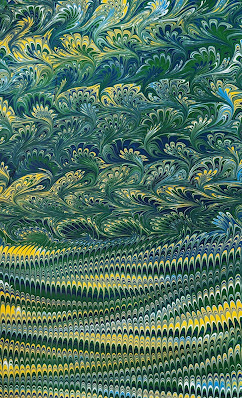

Although I was going for a subtler effect, I'm glad in the end because I would have missed out on a great paper otherwise!

If you want, you can run a bamboo skewer through the stones to create swirls and currents as I did here.


The next pattern, Nonpareil, involves combs.  I didn't take any pictures of the process, but here is my first result, using yellow, red, blue, green, and white.


Dark and light blue with white Nonpareil, lightly swirled with a skewer.


This next one shows how you can build on a pattern with another combing technique to create a Bouquet pattern.  I loved how the colors looked in the Nonpareil and couldn't give them up, so I decided to do only part of the paper.


The idea is to create elements that are the same shape as the eye on a peacock's feathers or rows of bunches of posies.  Mine are more like waves on the sea, but I hope to work on that.


After this we were set loose to play with whichever patterns and colors we wished.  I continued with the Bouquet, changing colors to begin to learn more about what works and what doesn't.  I realized that I like to include some white to lighten the composition.  This next one would be very muddy to my eye if I hadn't.


I got closer to the ideal shape here.


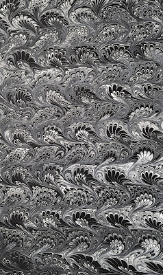
My final version was black and white, which came out even better than I imagined.  More like ocean waves than posies, but I really like the sense of movement.


I had a wonderful time and am looking forward to marbling papers on my own in the next year.  In the meantime, I'm beginning to use what I created in cards and calendars.

Thank you Brittani and Judith!

Monday, January 01, 2024

Happy New Year 2024!

A new year, a great time to branch out with new techniques to be more creative.  


Instead of using printed designer paper, I painted the background in shades of pale blues and greens metallic watercolors.  The shimmer of the paint doesn't show up in the photograph.  

I was able to stamp the calendar using inks of similar colors, Lost Lagoon and Blueberry Bushel (both from Stampin' Up!).

The snowflakes are from a retired Stampin' Up! stamp set.  I stamped them with Versamark and used white heat embossing powder.

Speaking of branching out, I'm no longer a Stampin' Up! demonstrator, so I'll be able to bring you the results of my playing with other companies' items.  While I love Stampin' Up! products, there have been so many others calling to me and I finally gave in.

Looking forward to a creative year!